There’s a quiet war happening in your LinkedIn feed every day. It’s not fought with arguments or ads — it’s fought with visuals. And the companies winning that war know one secret: a great product, poorly presented, loses to a mediocre product shown beautifully.
Enter the iPad mockup. Once a niche tool for designers and app developers, it has become the unsung hero of B2B content strategy. Tech companies, SaaS platforms, and digital agencies are using it to make their software look like it belongs on a billboard in Cupertino. But why? And more importantly, how?
Why LinkedIn Is the New Product Showcase
LinkedIn isn’t just a resume platform anymore. It’s a visual storytelling engine where first impressions are made in milliseconds. Decision-makers scroll fast. Your content has roughly two seconds to earn a pause.
A screenshot dropped flat into a post looks like homework. The same screenshot inside a sleek, angled iPad mockup looks like a product launch. That’s not illusion — that’s intentional design communication.
B2B buyers are still human. They respond to beauty, clarity, and professionalism. When a software company presents its dashboard inside a glossy device frame, it signals competence before a single word is read. The context created by a well-chosen mockup says: “We care about how things look. Imagine how we’ll care about your product.”
Real-World Examples: iPad Mockups in B2B Practice
This isn’t theory. Here’s how companies are actually using iPad mockups in their LinkedIn content strategy:
Project management platforms regularly post feature update announcements with an iPad displaying their new kanban interface in landscape mode. The wide screen of a tablet is perfect for showcasing complex dashboards that would feel cramped on a phone mockup.
Healthcare SaaS companies use iPad mockups to present patient-facing apps in clinical-looking flat-lay compositions — think white background, clean framing, soft shadows — reinforcing trust and sterility that aligns with their brand values.
EdTech startups drop their learning interfaces into colorful, dynamic iPad scenes with multiple device angles to show responsiveness across orientations. It communicates versatility without writing a word.
Design agencies use them in case study carousel posts, walking followers through a client project screen-by-screen, each slide featuring a different angle of the same device. The result feels cinematic and intentional.
Enterprise analytics companies embed their charts and reporting tools inside iPad Pro frames tilted at dramatic angles with subtle background gradients — making data feel exciting rather than daunting.
The pattern is consistent: context transforms content. An iPad doesn’t just hold the screenshot. It frames the story.
What Makes a LinkedIn Mockup Strategy Work
Not every mockup lands. The ones that do tend to follow a few unspoken rules:
- Match the device to the product. Dashboard-heavy B2B tools belong on tablets. Quick-action tools belong on phones. The device choice communicates use context immediately.
- Respect whitespace. Cluttered compositions kill the effect. The best LinkedIn visuals give the eye room to breathe.
- Stay brand-consistent. A mockup in colors that clash with your brand palette creates visual dissonance, even subconsciously.
- Use angle and lighting intentionally. A top-down flat lay reads as editorial. A three-quarter angle reads as product presentation. Choose the feeling you want to evoke.
LinkedIn’s algorithm also favors native document posts and carousels — both formats where iPad mockups shine as visual anchors across multiple slides.
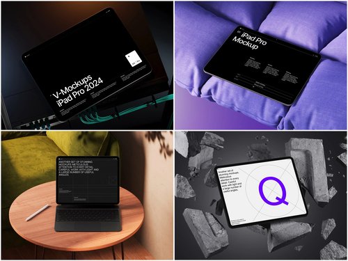
iPad Mockups on ls.graphics
For teams serious about visual quality, ls.graphics offers a standout collection of iPad mockups built for professional use. The scenes feature ultra-realistic rendering with carefully organized layers, making customization fast and intuitive. You’ll find a wide range of angles — from top-down editorial compositions to dramatic three-quarter perspectives — paired with multiple color styles and stylish minimalist backgrounds. There’s also an Edit Online feature for quick, browser-based customization without opening any design software. Best of all, a generous selection of free scenes lets you explore the quality before committing. It’s the kind of resource that makes good design feel effortless.
Conclusion
The iPad mockup is no longer a designer’s luxury — it’s a B2B communicator’s essential tool. In a LinkedIn landscape overflowing with text-heavy posts and forgettable graphics, a thoughtfully presented product visual cuts through like nothing else.
The companies that understand this aren’t just selling software. They’re selling confidence, professionalism, and vision — all before anyone reads the caption. If your content strategy hasn’t embraced the power of device mockups yet, you’re leaving first impressions on the table.
Start with quality resources like ls.graphics, match your mockup to your message, and watch your LinkedIn engagement tell the story your product deserves.